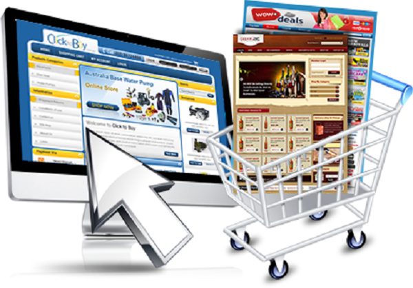
One can hardly argue that an eCommerce sphere is becoming more and more important these days. Due to its flexibility, online shopping has become as easy as riding a bicycle, and now many people are involved in it. The chances are high that you also own an online store; and I’m perfectly sure you have bought something via Internet at least one time in your life.
However, this easiness of an online business has also some negative effects which are mostly reflected in high competition. Every day we see numerous online stores, good offers, variety of products on display, but we must choose something out of this variety as we can’t buy everything we see. And here a question arises: how do a person chooses something out of all products and offers? What influences them? Actually there are some mechanisms that have an impact on customers’ choices, and I’m happy to say you have a full control over them and can make some steps to stand out head and shoulders above your competitors.
An appealing design is a definite win- win
Will you ever prefer going back to a shopping mall or a grocery store if you find it completely disoriented or say, it is poorly maintained? Your answer is a BIG no and this is exactly the case with an e-commerce website. A website that is well- maintained and updated from time to time will improve its reach over a span of time and will also make way for bringing in repetitive customers. Assuring your customers that everything they need is well- kept as well as maintained is a great way of ensuring that they will not only appreciate your great services; rather they might also refer your e-commerce website to their pals and colleagues at work. Here, the power of word to mouth publicity will bring in more business and trusted customers for your online business.
Effective Core Conversion Points
How many times have you zestfully visited an e-commerce website and then made your way out of it because it did not appeal to the buyer in you? It surely takes a lot of efforts on the part of the marketing team for converting a shopper into a buyer on an e-commerce website. Getting the most effective core conversion points for your website is a great way of bringing in more revenue and in the long run, this is a sure shot method of attracting customers. Few factors which determine the core conversion points in an e-commerce website are its functionality, design, usability as well as the level of security you are providing your buyers with.
Homepage+ Search bar: The Winning Formula
It is rightly said that first impression is the last impression and in the case of an e-commerce website, the homepage is what leaves the first as well as ever-lasting impression on any prospective buyer. A perfect homepage must have a friendly and welcoming look with the company logo somewhere at the top, a search bar at the top, a sales promotion tab as well as all important props aligned towards the centre. A globally- placed search bar is what further enthrals customers especially if it is still a part of your screen when you are scrolling down towards the bottom of a page.
Easy navigation and checkout
A navigation plan which is clear, easy and fast will increase customer- usability many folds and they will be able to hop on from one tab or category to another with utmost ease.
Buyers are often seen complaining about the hassles of getting past the checkout page and this is a huge factor which can lead to the shunning of a website altogether. Few important elements of a perfect checkout page: A progress indicator, a readable order summery, a link to the terms and conditions towards the bottom of the page, well- presented payment options, badges assuring the buyers about secure and trustworthy shopping!!
The anatomy of a perfect e-commerce website consists of all these factors and these will collectively work towards making your online business a great success.
