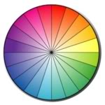
The best use of color for your Website, Online Store or Blog?
Put a colorful face forward. The visual appearance in your marketing materials can turn on, and even turn off, potential customers or readers. It does not matter if it’s on paper (flyer, newsletter or other advertisement) or online (website, eBay Store, other online shop or blog), it applies to both.
Is it really that important? Well I think it is.
In fact, I’m not alone here, major corporations agree as well. These corporate giants spend billions of dollars on doing color market research, usually in product or packaging development. Their research has discovered that people do make a subconscious decision about an environment or product within minutes of viewing and between 60% and 90% of that assessment is based on color alone.
The Colors You Use
 The colors you use may influence whether a potential buyer will remain and continue looking through your site, or leave!
I repeat, may. I have also seen where the use of unusual colors or visual effects by some websites, who to me do everything wrong, yet don’t seem to suffer by doing so. So these theories are not absolute.
For me, if the purposeful use of color attracts or helps a potential buyer remain on your website, or encourages them to buy, then that is something I take into consideration. I have always believed that although content is extremely important, it is not the only factor.
Consider this. The next time you are at your favorite fast food restaurant, look closely at their use of color. Do they decorate with reds and oranges? If so, that is because those colors encourage people to eat and leave quickly. And frankly, that is exactly what they want.
Or visit large corporate websites, these guys have spent big dollars on this type of research. Look at eBay, their search pages were previously in a pale yellow, looking for warmth and happiness, and which actually matched their marketing strategy at the time. They now focus on attracting youthful buyers and using clean white backgrounds. And what about General Motors, they often use blue (for trust and reliability) and silver (for prestige).
Color References
Cultural Differences – Colors obtain symbolism through cultural references in the culture you grew up in. Depending upon the culture, colors can have very different meanings and may actually cause problems for your site. For example, in the East, white is the color of funerals while in the West white is the color of Weddings. In China, white symbolizes death and in Brazil it’s purple.
Class Differences – Marketing research in the United States has shown that working class people tend to prefer colors that you can name: like blue, red, green, etc. While more highly educated classes tend to prefer colors that are more obscure: like taupe, azure, mauve, etc. This is why Walmart does their store logo in blue.Gender Differences – In many cultures, men tend to prefer cooler colors (blues and greens) while women tend to prefer warmer colors (reds and oranges).Location – People from countries with warmer climates generally respond more favorably to warmer colors; where people from countries with cooler climates respond more favorably to cooler colors.In the US and Canada, the following are general color references:

Pick colors for your market
First, make sure you have the right target market.
If you have a website or online store and use colors because they are your favorite colors, then you risk choosing them for the wrong target market. After all, you are you are trying to attract and sell to potential buyers, not yourself.
We’ve all been subjected to sites with unpleasant color combinations. I have seen a few that although the colors used may be the owners favorite colors, they are either very hard on the eyes (almost blinding) or make the text very difficult to read. You want people to view your website with ease. Remember, it’s easy for your visitors to press the back button.
Make sure that all of your marketing materials have the same color scheme. Nothing looks tackier than have three different color schemes going on between your website, newsletter, and business cards. So, before you go out and get a newsletter and free business cards printed, make sure that you’ve settled on a color scheme for your website.
Colors affect Shopping Habits
Did you know that……
Red, orange, black and royal blue attract impulse buyers
Pink, teal, light blue and navy attract smart budget Shopper
Color Codes
 Looking for color codes and 3d animation tutorial ? I have a friends blog anime spider of both non-dithering and basic color codes for you to refer to.
What’s non-dithering color codes? In layman’s terms, these colors will look like the color you ask for on all browsers and all computer screen resolution settings.

